SeedSigner
How we fit a modern, smartphone-inspired interface onto a 1.3-inch screen — and what we learned about designing for Bitcoin self-custody along the way.
Overview
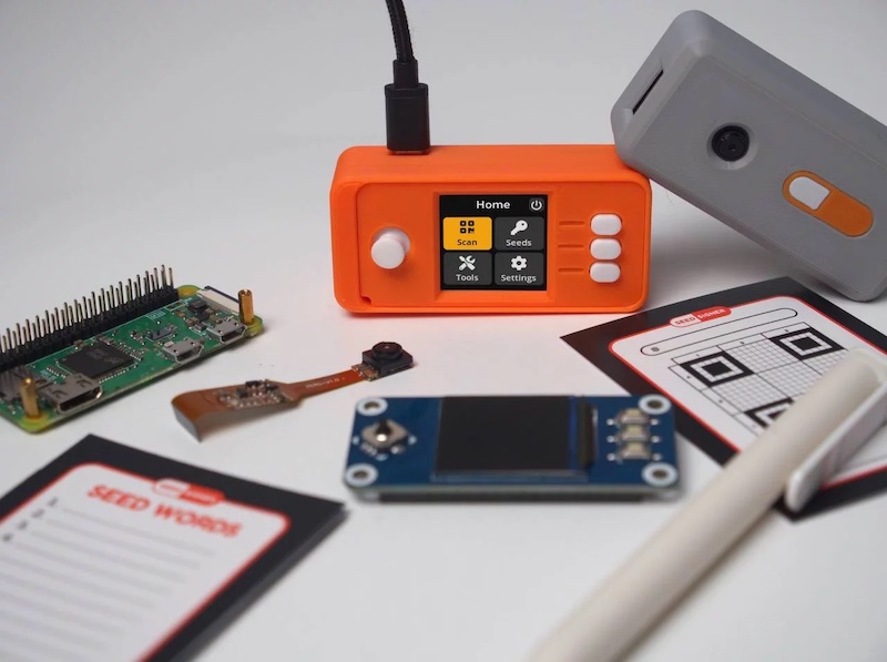
SeedSigner is an open source, air-gapped Bitcoin signing device built from off-the-shelf components for under $50. It is stateless by design (it never stores private keys) and functions as a “Swiss Army Knife” of offline Bitcoin tools: key generation, transaction signing, multisig coordination, seed backup, and address verification.
In April 2022, the project released v0.5.0, a ground-up redesign of the software interface. The effort replaced a bare-bones, text-only menu system with a modern, icon-driven GUI: a navigation bar, design system, custom iconography, and an information architecture modeled on smartphone conventions.
This case study examines the goals, process, design decisions, and outcomes of that redesign.
At a glance
| Project | SeedSigner |
| Timeline | June 2021 – April 2022 (v0.5.0 launch) |
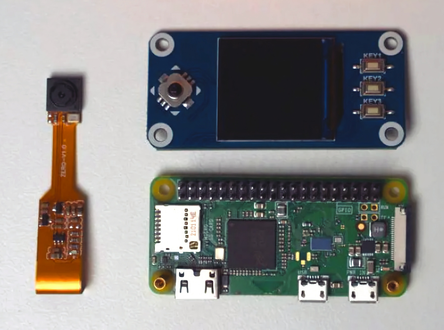
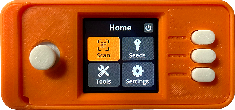
| Platform | Raspberry Pi Zero + 1.3” 240x240 LCD + Camera + Joystick |
| Team | SeedSigner the Man (project lead), Keith Mukai (lead developer), Newtonick (lead maintainer), Easy (UX design), and community contributors |
| Links | GitHub – Design System – UX Guidelines |
Background
A new mental model for Bitcoin keys
SeedSigner entered the Bitcoin ecosystem with a fundamentally different philosophy. Where commercial hardware wallets treated the device as a persistent vault (storing keys, managing wallets, connecting to companion apps), SeedSigner, inspired by Specter-DIY, separated these concerns:
Keys > Signing Device > Software Coordinator
This mental model was a breakthrough. The device is merely a tool for operating on keys, not a container for them. Users generate or import a seed, perform a task (sign a transaction, export a public key, verify an address), and power off. Nothing persists.
This stateless architecture made multisig click for many users who had found it intimidating. Instead of buying and managing multiple branded hardware wallets, users could build multiple inexpensive SeedSigners, or use a single device with multiple seeds.
The problem
By early 2021, SeedSigner had proven its concept. The hardware was cheap and accessible. The mental model was elegant. The community was growing. But the software interface told a different story.
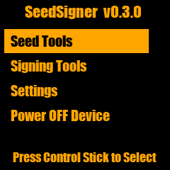
The UI was a series of text-based list menus. Functional, but only for hobbyists. Finding a loaded seed required navigating Seed Tools > Store a Seed (temp) > Display Seed Slot #1. There were no icons, no navigation bar, no visual hierarchy, no consistent interaction patterns. Labels used technical jargon. The power button lived inside the main menu alongside operational items.
The innovative technology with an intuitive mental model was trapped behind a UI that only hobbyists would use.
Like many free and open source software (FOSS) projects, SeedSigner had prioritized function over form. The challenge was clear: could a modern, user-friendly interface fit on a 1.3-inch, 240x240 pixel display?
Goals
The v0.5.0 redesign was organized around four design goals that would guide every decision.
1. Visual Design
Improve aesthetics and provide visual aids using UI treatments and iconography. An attractive interface is not vanity; research consistently shows that users perceive aesthetically pleasing designs as more usable (Aesthetic-Usability Effect).
2. Interaction Design
Increase overall efficiency of user inputs and feedback. Minimize button presses, reduce scrolling, and make interactions predictable.
3. Information Architecture
Improve findability by organizing and surfacing common tasks. Users should intuitively know where to go, and never feel lost.
4. Content Design
Simplify language to make abstract concepts more accessible to the average user. Bitcoin is already complicated; the UI should not add to that complexity.
Who benefits?
These goals were not just about the device. The redesign aimed to create impact at three levels:
- The user: Improved usability, accessibility, and understanding of self-custody
- The project: Attract more users and contributors, position SeedSigner as the beginner-friendly DIY signing device, elevate the brand
- Bitcoin: Increase self-custody adoption, advance the cold storage space, grow the FOSS ecosystem
The Design Challenge: Hardware Meets Software
What makes SeedSigner a uniquely difficult design problem is that the user experience spans both hardware and software, extending beyond the device itself.
The three-part UX problem
Unlike a mobile app or a website, a signing device’s UX is split across three distinct surfaces:
- The physical device: a 3D-printed enclosure with a joystick, three hardware buttons, a camera, and a tiny screen
- The on-device software: the 240x240 pixel interface the user navigates with the joystick
- The software coordinator: a separate desktop application (Sparrow Wallet, Specter, Nunchuk, etc.) that the device communicates with via QR codes
The designer cannot control the coordinator experience, yet the user’s end-to-end task (e.g., signing a transaction) spans all three surfaces. Half the education problem lives in the coordinator interface, which cannot be shown on the device’s screen.
Constraints as creative fuel
The 1.3-inch display imposed extreme constraints:
- 240x240 pixels of usable screen real estate (224px with 8px margins)
- No touchscreen: all input via a 5-way joystick and three side buttons
- Font sizes as small as 14px needed to remain legible at smartphone distance
- No web standards to rely on; WCAG guidelines don’t address non-standard displays
- No analytics: an air-gapped device cannot collect usage data
These constraints, rather than limiting the design, forced creative solutions that ultimately produced a cleaner, more intentional interface than many projects with unlimited screen space.
Process
Concept: A design exercise becomes a project
In June 2021, UX designer Easy undertook a design exercise: could a modern UI fit on SeedSigner’s tiny screen? The experiment produced a Figma prototype that was shared with the SeedSigner community.
The response was immediate. The team — SeedSigner the Man (project lead), Keith Mukai (lead developer), and Newtonick (lead maintainer) — saw the potential and began collaborating on a full UI overhaul. What started as a speculative design exercise became a 10-month effort culminating in the v0.5.0 release.
Design principles
Four principles guided the design process:
Concept. Rapid iteration to explore and refine solutions before building. Index cards and Figma prototypes allowed the team to exhaust possibilities before writing a single line of Python.
Consistent. Leverage established patterns. Rather than inventing novel interactions, stand on Apple’s shoulders. If a navbar works on 4 billion smartphones, it will work on SeedSigner.
Concise. Edit ruthlessly. On a 240px screen, every pixel and every character counts. Help users accomplish their task without getting in the way.
Clean. Minimal aesthetic. Less visual detail means easier design and development, better legibility at small sizes, and a look that ages gracefully.
UX laws that shaped the redesign
Several established UX principles directly informed design decisions:
- Jakob’s Law: Users expect software to behave like other software they’ve used. Follow existing conventions; don’t reinvent the wheel.
- Tessler’s Law: Complexity cannot be eliminated, only moved. Bitcoin is inherently complex; abstract it away from the user wherever possible.
- Paradox of the Active User: Users never read the manual. Design for how people actually behave; let them poke around and learn by doing.
- Mental Model: Align the system with the user’s existing understanding. Most people already know how banking apps work; leverage that knowledge.
Design Decisions
Building a miniature design system
The first deliverable was a design system purpose-built for SeedSigner’s constraints: a set of reusable Lego blocks that would free the team to focus on features rather than reinventing UI elements for every screen.
Visual design foundations
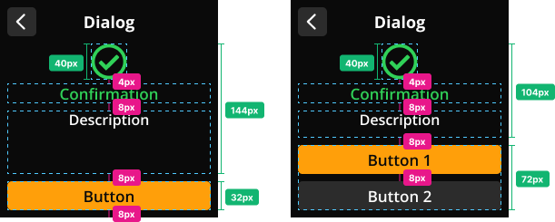
8px Grid System. All measurements follow increments of 4px and 8px, creating balanced, consistent spacing across every screen. With 8px margins, the usable content area is 224px wide.
Typography. The team selected Open Sans, an open source font family that remains legible at small sizes. An angular resolution calculator was used to determine minimum font sizes for a screen held at smartphone distance (~30-35cm). The result: 17px body text and 20px headings, enhanced by Keith Mukai’s super-sampling implementation for sharper rendering.
Color Palette. A vibrant dark mode palette designed for contrast and clarity. Light text on dark backgrounds provides adequate contrast at small sizes, while color is reserved for semantic meaning: orange for active/selected states, green for success, yellow for warnings, red for errors.
Iconography. A custom, open source icon set designed specifically for SeedSigner. Icons were converted from SVG to OTF font format and rendered via Pillow’s ImageFont library. Categories include menu icons, utility icons, messaging icons, and informational icons.
Components
Reusable components form the building blocks of every screen:
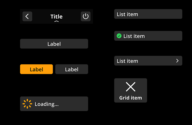
- Navigation Bar (240x48): Present on every screen with a back arrow, title (13 character max), and optional action button
- Grid Items (108x80): Icon + label for the home screen grid menu
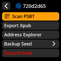
- List Items (224x32): Multiple variants for submenus
- CTAs: 1, 2, or 3 button configurations fixed to the bottom of the viewport
- Buttons: Large, medium, small, flyout, word input, and dice input variants
- Messaging: Contextual overlays for success, warning, and error states
Layouts
Components aggregate into predefined screen templates:
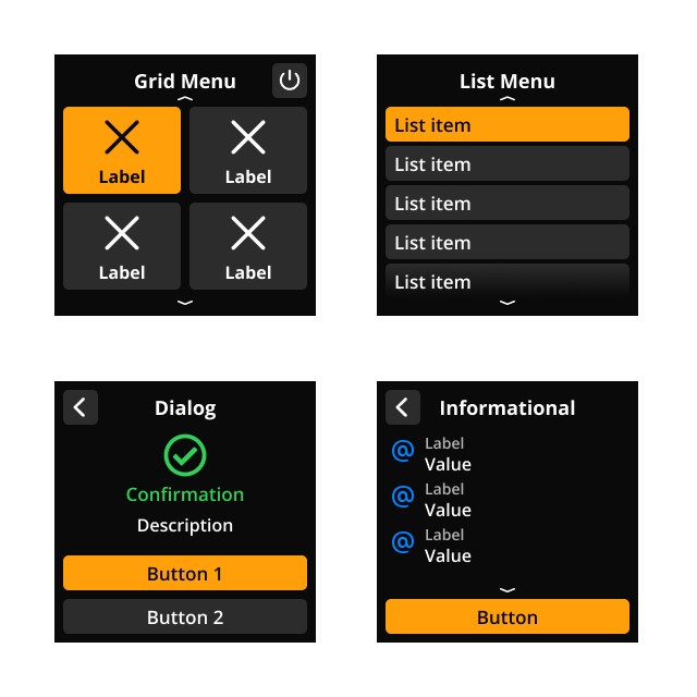
- Menu (Grid): The home screen, presenting four options with icons
- Menu (List): Submenus with scrollable list items
- Input: Screens for seed word entry, passphrase input, dice rolls, etc.
- Review: Summary screens before finalizing an action
- Dialog: Decision prompts with messaging icons for urgency levels
- Messaging: Non-interactive overlays (snackbars) for system feedback
Navigation overhaul
The most immediately visible change in v0.5.0 was the introduction of a consistent navigation pattern.
Before: Navigation was embedded within the content. The joystick handled both selection and forward/back movement. There were no visual landmarks to orient the user.
After: A persistent navbar with a back arrow and title appears on every screen. Call-to-action buttons are visually distinct and fixed to the bottom of the viewport. The joystick is reserved for selection; forward/back navigation uses on-screen buttons.
This seemingly simple change had outsized impact. It followed Jakob’s Law (navigation should work the way it does on your phone) and freed users to focus on their task rather than the controls.
Information architecture restructure
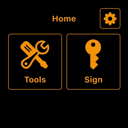
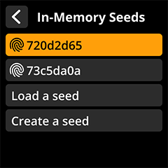
A new home screen
The text-based main menu was replaced with a 2x2 grid of icon-labeled tiles: Scan, Seeds, Tools, and Settings. This grid became SeedSigner’s defining screen, scannable at a glance with each option one tap away.
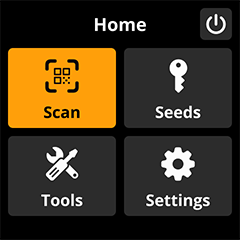
The power button was moved out of the main menu and into the navbar — a small change that eliminated a common source of accidental shutdowns and reduced cognitive load.
Object-first interactions
The team adopted an object-oriented interaction model: select the object first, then choose the action. Instead of hunting through a Tools menu for “Generate XPUB,” users navigate to Seeds, select a seed, and then see all available operations.
The old flow to create an Xpub:
Signing Tools > Generate XPUB > Use a saved seed > Use Seed Slot #1
The new flow:
Seeds > Select Seed > Export Xpub
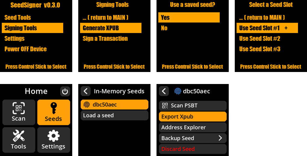
This was a fundamental shift. The early UI was shaped by code, not users. Reframing the design around user goals, rather than system architecture, unlocked a restructuring that wouldn’t have been possible by iterating on what already existed.
Contextual navigation
High-traffic actions were surfaced where users expected them. “Create a seed” and “Load a seed” were added directly to the Seeds menu, not buried in Tools. Alternative entry points remained in Tools for redundancy, but the primary path followed user expectations.
The demand for contextual navigation pushed the codebase toward a more flexible architecture — a strength that would pay dividends for every feature that followed.
What Makes SeedSigner Unique
A category of one
SeedSigner occupies a unique position in the Bitcoin hardware space. It is not competing with commercial hardware wallets on their terms — it has created its own category.
| SeedSigner | Commercial HW Wallets | |
|---|---|---|
| Cost | ~$50 DIY | $70-300+ |
| Keys | Stateless (never stored) | Persistent storage |
| Source | Open source | Varies (often proprietary HW) |
| Supply chain | Off-the-shelf components, self-assembled | Manufactured, shipped to user |
| Customization | 3D-printable enclosures, community designs | Fixed form factor |
| Mental model | Key tool (use and discard) | Key vault (store and protect) |
| Availability | Global (Raspberry Pi + generic parts) | May be restricted or flagged in some jurisdictions |
The SeedQR innovation
One of SeedSigner’s most influential UX innovations is SeedQR, designed by Keith Mukai: a compact QR code format that encodes a BIP-39 seed phrase. Users can transcribe their seed as a small QR code on paper or metal, then scan it to instantly load their seed into the device.
SeedQR has been adopted by other projects (including Blockstream Jade) as a fast, reliable method for loading seeds without tedious word-by-word entry. It’s a perfect example of innovation emerging from constraint: the camera was already on the device for QR-based transaction signing, so why not use it for seed loading too?
Hardware + software: The other 50% of design
The physical enclosure is not an afterthought. It is a core part of the SeedSigner experience. Community members have designed dozens of 3D-printable enclosures, from the iconic orange “pill” shape to rugged field cases. Joystick toppers, custom button caps, and hardware modifications have all improved the tactile experience.
This physical customization layer is unique among signing devices and contributes to SeedSigner’s identity. Users feel ownership not just of their keys, but of their device.
Impact
Since the v0.5.0 release in April 2022, SeedSigner has experienced significant growth across every metric. The GitHub repository has grown to over 1,000 stars and SeedSigner is now supported by all major coordinator wallets. The project continues to add more languages, features, new hardware and enclosure options, and UX improvements. Its popularity demonstrates the success of the redesign effort, and the need for thoughtful design in Bitcoin storage solutions.
Acknowledgements
This redesign was a team effort. SeedSigner (project lead) brought the vision, mental model, and unwavering commitment to simplicity. Keith Mukai brought pixel-perfect implementation, creative design solutions, and the technical architecture that made the design system possible. Newtonick maintained the repository, championed QR standardization, and together with DesobedienteTecnológico added reproducible builds. Jean Do contributed code, testing, and tireless community support. We are grateful to the many other contributors and the broader SeedSigner community (enclosure designers, testers, translators, and users) for their work, feedback, and energy that drives the project forward.
This case study was written by the SeedSigner design team. The project is fully open source — contributions are welcome on GitHub.
Explore the SeedSigner Design System and UX Guidelines for detailed documentation.
Next, view the How it works section to learn more about the mechanics of various aspects of bitcoin.